3 Tooltip Tips in Tableau
3 Tooltip Tips in Tableau – Andre de Vries – Medium

Tooltips are often neglected and overseen in Tableau. Sometimes you see great dashboards which tell an amazing story but once you start hovering over marks you'll notice that the designer didn't pay any attention to the tooltips. You'll see the default tooltip Tableau gives you which include all the fields in your view in in Arial 10. For me tooltips are part of the finishing touch of a Tableau dashboard and every great viz should have tooltips that are first of all, formatted, fit to the overall design of the dashboard and engage the enduser with the story that is being told in the viz.
In a recent viz of mine I used some techniques in the tooltips which I had never used before. You can see the dashboard here. In this blog I will share three techniques with you that I used and that will make your tooltips look great.
- Use dynamic colouring in the tooltips
- Use a calculation to include/exclude elements in a tooltip
- Use a calculation to change the starting text of tooltip elements depending on a dimension (yes, I had no idea how to concisely describe this tip)
Because the data I used was so suitable for telling a great story, global conflicts since the end of the Cold War, I also wanted my tooltips to convey this story. Many thanks again to the Uppsala Conflict Data Program for making this dataset publicly available.
Dynamic Colouring
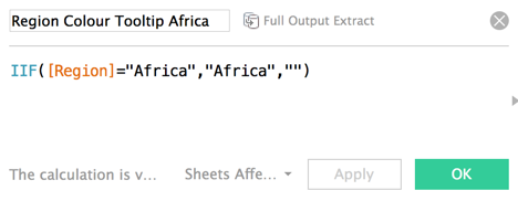
This tip has been around for quite some time but it's very useful and instantly makes your tooltips look great. In my dataset I had conflict regions and I had them coloured in my scatter plot but I also wanted this colour to be reflected in the tooltips. The trick here is to split the members in your dimension into individual calculations. The IIF function can help you with this. In the image below I selected the region 'Africa', and when the Region is not Africa it would return a null or a space. If you repeat this calculation for every member you want to colour, for my viz I had to create 5 separate calculations for each region, then you can apply this to your tooltip.
This was the tooltip I used in my viz:
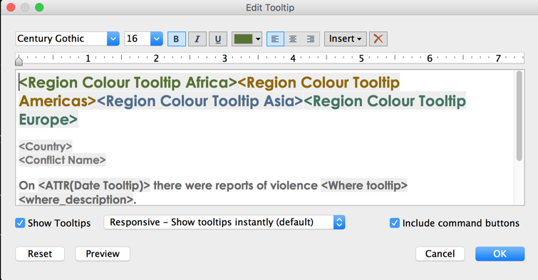
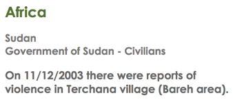
When you drag all the individual (region) calculations in the tooltip you can colour them accordingly. This is how the tooltip looked when I hovered over a mark that has Africa as the region. Because I included null (or a space) in the calculation it will not show the other regions in the dataset.
Include Exclude elements in a tooltip
This technique builds on the previous tip and is useful when you only want to show data when there is actually something to show. Sometimes you have null values or zeros in your dataset but you still have the title of the dimension or measure in your tooltip. With this calculation, which you can tweak and make as advanced as you want, you can even remove the dimension title by including this in the calculation.
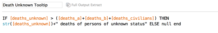
My dataset contained the number of people that died on a particular day split by conflict party and whether there were civilian victims. The dataset also contained data on so-called 'unknown deaths', which were not confirmed. However, there were not always civilian or unknown deaths so I wanted this to only show up in my tooltip if there were victims.
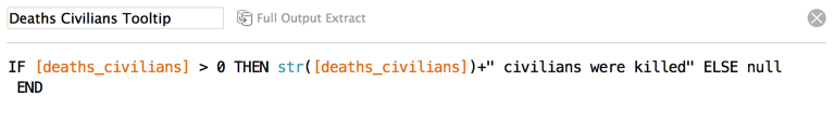
My calculation evaluates whether there are civilian victims and then returns this value plus a text string saying 'civilians were killed'. This will return a tooltip that includes for example '18 civilians were killed' but it won't show up at all when there were no civilian victims. I then created another calculation which was similar to this one but here I only wanted to have the unknown death toll to show up when this was higher than the total number of reported deaths. The story I tried to convey here was how (un)transparent conflict reporting was across different regions and conflicts.
Change the starting text of a tooltip element
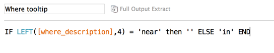
The third and final tip is useful when you have a dimension that contains text and you want this to show up in your tooltip. The dataset I had contained a text field called 'Where'. This dimension was made up of descriptions of conflict events and where they had taken place. However, the description was not always consistent. For example, occasionally an event had taken place 'in' a village or city, or 'near' a particular area. When you drag this 'Where' dimension in your view you can't make a grammatically correct sentence in the tooltip. I solved this issue by creating a calculation that looked for the first four characters in the sentence and returned a white space or a null when this was 'near' but if this wasn't 'near' then the sentence would start with in. I then added this calculation to the tooltip.
